
A rant about the "modern" UI/UX trends
Since this will be a longer rant, a quick table of contents
- Dialog boxes and button placement
- Window decorations
- The slowly demise of classic menus
- Checkboxes and radio boxes
- Overly flat designs
- Icons without explanations
Dialog boxes and button placement
We all are familiar with dialog boxes, starting from the "are you sure?" to typical "file open/save" dialogs.
I'm mainly talking about the buttons on the bottom right, here an "Open" and "Cancel" button.
You can argue about the ordering, should the cancel be on the inside or outside, there are arguments about either way.
I recently tried to switch from x11 to wayland (if you don't know what this is, just ignore it, not part of the rant), but suddenly
the GTK applications (also ignore, if you don't know that) like GIMP, Inkscape, Firefox or Thunderbird use the GNOME layout of their dialog boxes.
And there, buttons are on top. What The UX?
Who thought, this was a good idea? Obviously many people otherwise they would not use that on the whole GNOME desktop.
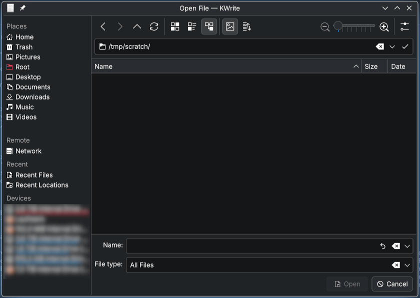
But for me, this is crazy, you start reading at the top, let's skip the server side decorations (or lack of) for the dialog box, see below.
First you have the buttons and the file name, then below a chooser and then you need to go up again to confirm. Also you have options on the bottom as well, so completely inconsistent.
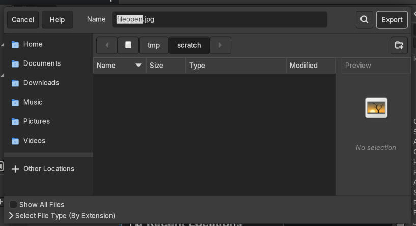
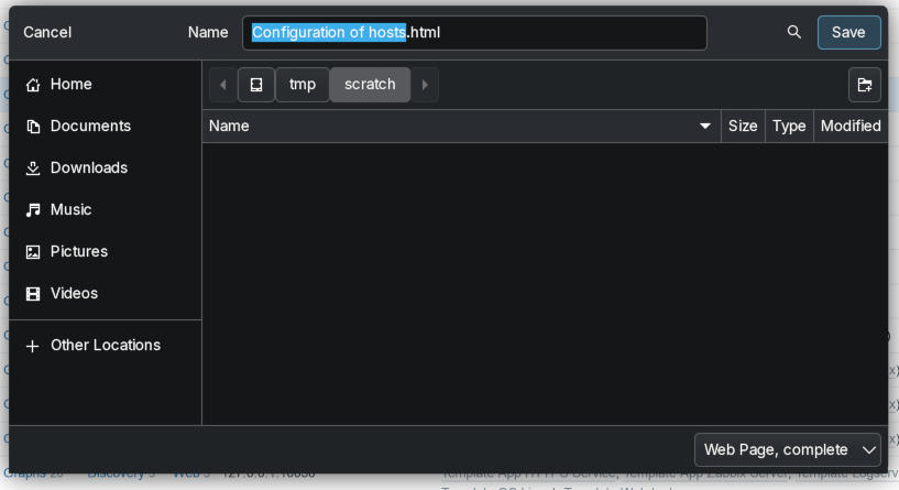
Let's look at Firefox, the print dialog has the button on the lower right: good. save as shows similar to the above, consistency, usability, trained behavior: who needs that anymore?

Also notice the lack of any kind of border on the cancel button, how do you know this is a button? Another topic for later.
Also a bad example here when closing without saving:
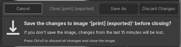
So first you say cancel, Save As or Discard then you can read what the buttons do.
This is like have to sign a legal document at the start of the text and not at the end.
We were trained to read those dialogs in a Z pattern starting from reading left to right in the header, then over the main content and at the bottom from left to right again.
Flip that if you are in a country where you read from right to left.
Now we have to skip the header, read the bottom part and go back to a previously read area. So we basically need to scan the header twice.
And since not every program does this constantly, sometimes you need to scan the dialog multiple times and when there are other buttons at the end (which happens, but not for closing the dialog) this is totally confusing.
Also notice the totally obvious and directly in you face highlight of the default buttons? No? Another point of modern design/UX anti-patterns...
Window decorations
As shown in the examples above, the GTK/GNOME style dialogs don't have a classic window border anymore. Those things around the actual content with the close and minimize functions. Another thing some designers have thought to get rid of, another fantastic idea (not).
I manually had to add some kind of separator (here a shadow) otherwise there would have been none. These are just there, no visual distance or separation from the other elements in the background, no different color of the header on focus or whatever. To see if the window has focus, the gray are just changes slightly in brightness. Great for usability and accessibility.
For the next example, I switched to a light theme, just to change it up a little. Here you see two windows with decorations, the left one with minimize, maximize and close, next to another window with a menu (more on that later) and a pin button to make it always visible.
Here as you obviously can't see well, the right window is the active one. Clearly visible by the dominantly different color of the window header and the intense blueish shadow around it. cough This is a default KDE theme. At least KDE let's you change that.
Finally to hammer my point home, a GIMP screenshot with 2 dialogs open. Which one is the active one?
The slowly demise of classic menus
The distant past
I was introduced to this thing called mouse and graphical user interfaces when I had my Amiga 500 in the mid or end of the 80s in the last millennium.
They did not invent that style of menus or perfected them, but it was my first contact.
Back than you used your right mouse button and the menu showed at the top bar (common for all applications).
You could move the mouse over the menu points and they showed options as if being pulled down, hence the name "pull down menu"
For those who have not seen this before, here a short version: (click to play)
On most applications and desktops (Windows, many Linux and MacOS) this is still kind of similar. Some offer the menu per application, some have a global one, but the concept has not changed for many decades. But now usually clicked on with the left mouse button.
Within a single click and moving the mouse you can see all options the current application has to offer.
The "modern" (Hamburger menu)
But there is the emerging trend of only showing hamburger menus where you need to click and more often than not, you need to extra click to have a menu expand. Try it on your browser on the top right.
- click on Hamburger menu,
- click on bookmark,
- click save current tab as bookmark.
Vs menu (Alt key shows it),
- click 1: "Bookmarks",
- click 2: save current tab as bookmark.
Only 1 click difference, who cares?
Not just that, assuming you did not know where in the menu it is, you had to click many wrong categories first. On many applications this does not auto-expand anymore.
Fun fact, the hamburger menu and pretty exact design was invented earlier, seemingly around 1981 on the Xerox Star. So technically it's a step back in UI and UX design and ignoring the improvements of a few years. Great job.
Modern (Ribbons)
But an even worse trend are ribbon toolbars instead of menus and toolbars.
Not only are the option not available behind a single click anymore, but you basically have tabs instead of menus and instead of dropping down to give you options you always waste space with a toolbar full of menu options.
Usually the size of 2 or 3 rows of actual toolbar icons and replacing a few dozen ones with a hand full in some weird "category" or "group".
Example from LibreOffice (which has a better version than Microsoft Word), no Windows here, so I can't make screen shot.
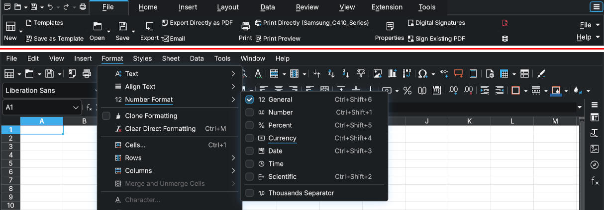
On the top of the red line ribbons (see the File/Help on the right), more options behind a drop down (but not all the options available via menu).
On the bottom the version with menu (and toolbars). Default layout.
60 icons/quick options via one click vs 14 plus extra via drop down and extra click.
Microsoft even has some extra pages in their knowledge base to find special options, because seemingly many people did not find that option anymore: Support page for "Paste Special"or how to use copy/paste in office
Keyboard only usage and shortcuts
Another advantage in menus is/was the use of keyboard commands.
In Menus you often see some letter that are underlined. These are for keyboard usage.
Taking the Firefox example:
- Press the Alt key, menu appears, notice the underlined B
- Press B for bookmarks
- good UX tools should have another underlined key per entry (Firefox does not, so you need to use the cursor), Firefox, go and fix that!
Also good UI should show the short cuts. Firefox does it, other program do not.
So in my verdict, bring back the classic menu and keep it alive (at least on web sites and desktops with huge screens and 2k or 4k resolutions). Mobile screens: different thing, I think this is fine there for fat-finger and tiny screen usage.
Check-boxes and radio-boxes
This is another hot topic. The slowly demise of check-boxes and radio-boxes.
A reminder:
Check-boxes: pick as many as you want
With fries
Radio-boxes: pick exactly one
Option A
A newish trend is to use mobile style even on desktop:
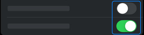
Also did you notice, you can click on the the text on the check-box/radio button to toggle/select as well, so an ever bigger click/tap target than those oversized toggle buttons.
Another trend I've seen which hopefully does not become popular:
Making radio-boxes and check-boxes visually identical. Yes, I've seen that with custom overwrites. You are not able to see anymore if it is a radio button (one choice) or check-boxed (multiple choices) without trying it first.
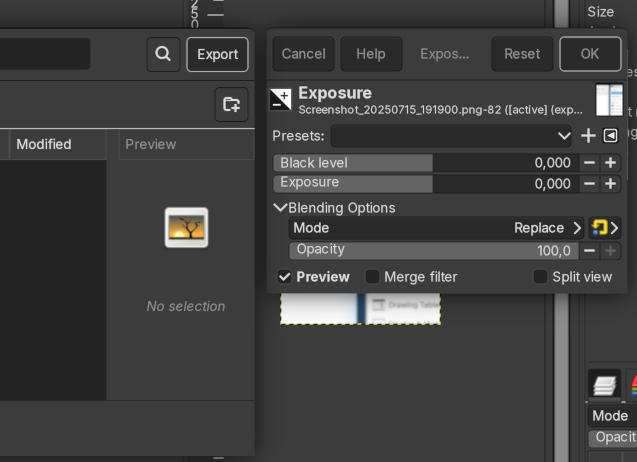
Overly flat designs
I get it, a matter of personal taste. But for me the pure flat designs are just too minimal. I have no idea what is a button, a menu or "just there".
How many times did you click/tap on something that you expected to be a button just to find out it isn't or by accident you learned, you have to swipe that thing instead of pressing on it? I had this with my banking 2-factor app. They switched from a button to a slide without showing "slide to accept". I struggled and just found that by acciddent. WHY? is pressing a button too hard for mobile users?
Ignoring the fact that accept was a red button, now a red slider. I know the their branding color is red, but for real? A red accept thingy?
Or maybe you completely missed functionality because you did not try that text that is actually a button and opens a menu with lot more things?
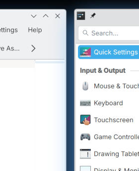
Icons without explanations
This is also a side effect of the flat designs. We have icons, no hover info (touchscreen) or just no hover on web site. What does the icon do?
Some are obvious, other are not
What do those mean? 
The left one is from a control system of a model train track, normally it goes to the right but can automatically go straight.
The middle one is from a game where you can adjust the car's ride height, obvious right?
And finally the last one is from a menu where this indicates spicy foods.
In context they might work without text, but usually you have enough space for a short text. Use that, please.
Enough ranting for today.